ACC Project Proposal

^Will replace the image above with an image from the exhibition
Night Shift
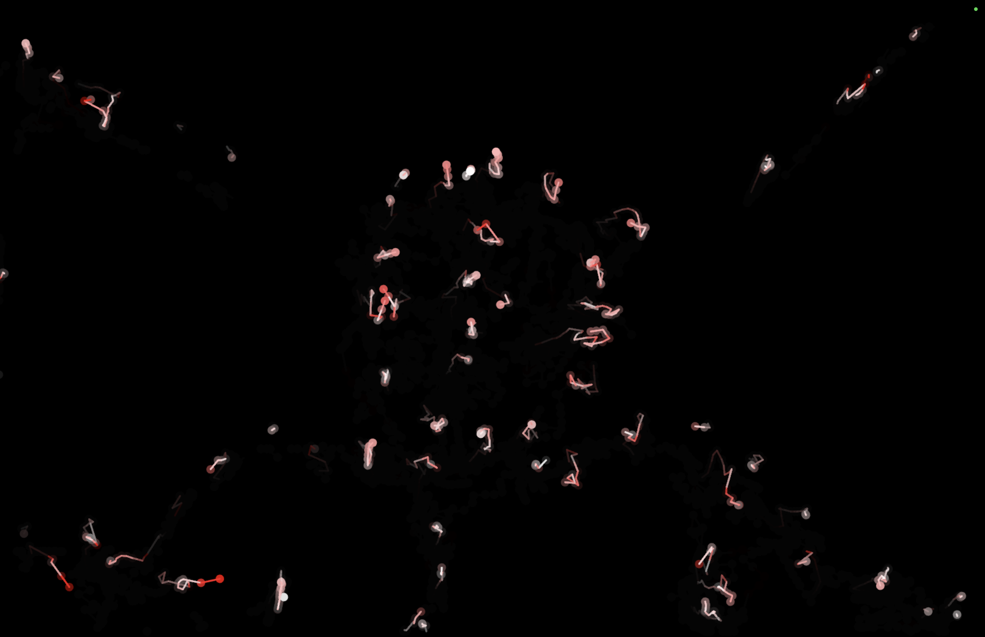
Night Shift uses a Frame Differencing technique commonly used in surveillance technology to plot the movements of people in an exhibition space. A camera takes a photo of the empty environment and a p5.js program calculates the difference between the original image and the latest updated frame. Positions are plotted live on a digital screen, higher speeds are represented with red coloring and decaying trails are drawn to show movement.
Inspiration
After deciding that my original idea didn't suit the technical requirements for the class exhibition, I started exploring ways I could manipulate localized data, but still achieve something like Aaron Koblin's Flight Patterns (my original inspiration). I thought it would be interesting to plot people in a room live in same way Koblin tracks flights on a map, by turning their movements into coordinates on a plane with points and trails. Looking into tracking solutions, I quickly stumbled upon a blog post on a technique commonly used in CCTV surveillance called Frame Differencing.
ACC Project Proposal

^Will replace the image above with an image from the exhibition
Night Shift
Night Shift uses a Frame Differencing technique commonly used in surveillance technology to plot the movements of people in an exhibition space. A camera takes a photo of the empty environment and a p5.js program calculates the difference between the original image and the latest updated frame. Positions are plotted live on a digital screen, higher speeds are represented with red coloring and decaying trails are drawn to show movement.
Inspiration
After deciding that my original idea didn't suit the technical requirements for the class exhibition, I started exploring ways I could manipulate localized data, but still achieve something like Aaron Koblin's Flight Patterns (my original inspiration). I thought it would be interesting to plot people in a room live in same way Koblin tracks flights on a map, by turning their movements into coordinates on a plane with points and trails. Looking into tracking solutions, I quickly stumbled upon a blog post on a technique commonly used in CCTV surveillance called Frame Differencing.